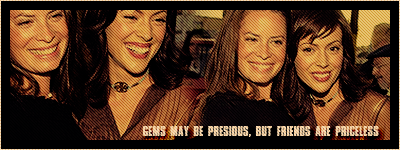
Natalie
Marquise of Luby
 Avatar by Me!
Posts: 262
|
Post by Natalie on May 19, 2008 7:49:55 GMT 10
Illegal double post. Anyway. This was my first ever fanart attempt. Check out my thread "Natalie's Fanart" to see how far I've come.  |
|
Hannah
Duchess of Luby
"And so the lion fell in love with the lamb..."
Posts: 309
|
Post by Hannah on May 20, 2008 6:48:15 GMT 10
Ok thanks guys!!  Ill just mess about with it and become a master at it!! lol |
|
|
|
Post by Joosje on May 29, 2008 5:06:25 GMT 10
Here I am again..with a pretty loong tutorial. Hope you'll like it!  no problemo! This was sort of requested from Kayli..but I'm sorry that it's such a long one! > Going from  to  > Using this picture:  > I've cropped my image down to 100x100px, just below the eyes because I think that it looked pretty cool. > I used a curves layer here to brighten the whole image up, but it goes extremely fine simply using a Screenlayer 100% of your image too. It'll end up being the same revery *friendly* person [Which I discovered about..now! Writing this tutorial] with other words: Duplicate your layer and set it to Screen 100% ORCurves: RGB:Output: 192 Input: 130  > Color Balance Layer. Midtones:Cyan: +17 Magneta: +27 Yellow: -11  > Another Curves layer, and this one you can't escape! RGB:1st point:Output: 85 Input: 84 2nd point:Output: 212 Input: 173 Red:1st point:Output: 68 Input: 76 2nd point:Output: 196 Input: 186 Green:1st point:Output: 40 Input 43  > Hue/Saturation Layer. Set it to; difference. Opacity: 20% Master:Saturation: +10 Lightness: -44  > Selective coloring layer. Whites:Cyan: +5 Yellow: +100 Black: +11 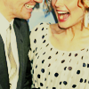 > Levels RGB:Black arrow: 0 Gray Arrow: 1,00 White Arrow: 245  > Color Balance Midtones:Cyan: +40 Yellow: +42 Shadows:Cyan: -45 Magneta: +10  > Selective Coloring Reds:Cyan: -27 Yellow: +19 Black: +5 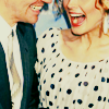 > Selective coloring, again. Reds:Cyan: -100 Yellow: +9 Yellows:Cyan: -51 Black: +6  > The final Curves Layer, set the opacity to; 50% RGB:Output: 114 Input: 129 Red: 1st point:Output: 50 Input:. 159 2nd point:Output: 224 Input: 210 Green:1st point:Output: 54 Input: 64 2nd point:Output: 226 Input:. 218 Blue:1st point:Output: 54 Input: 60 2nd point:Output: 209 Input: 204 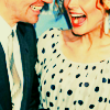 Finally I added a black box and "studmuffin'n'parter" text in Bold Georgia 8 pt & did a bit of edit -> 'free transform'-ing 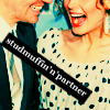 |
|
|
|
Post by Rach :) on Jun 5, 2008 6:46:22 GMT 10
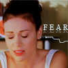 Okay, so I was thinking about making a tutorial for this icon but then when Jos said she liked the colouring I decided I definitely would, but it turns out I could remember what I actually did so I made one similar to it. 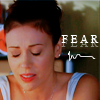 So here we go. 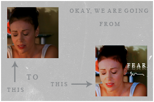 So I started with this lovely, but very sad looking capture of Phoebe. 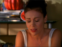 And I cropped it down to 100x100 to the way I liked it. 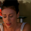 Okay next I duplicated the base layer 3 times. Then I changed the blending modes, from top to bottom – Screen
Screen
Soft Light
Background LayerThen I flattened everything, so I had one layer again. 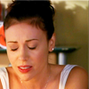 Next I added a blue fill layer. #526de5 and set it to Multiply – 33%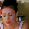 Then I added a Selective Colour layer. Settings – Reds
-100
0
0
0
Cyans
-100
+54
0
0
Blues
+100
0
-100
0
Neutrals
+18
0
0
0
Blacks
0
0
0
+23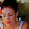 Then I flattened the picture and that is what I got. That’s it for the Colouring, easy peasy. You can do whatever you like to it. Here is what I did though. I used Times New Roman, white, size 11.I typed the word ‘fear’ in capital letters, leaving a space between each, like this ‘F E A R’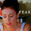 Then I duplicated the text layer, and then returned to the first text layer. I used the move tool to move it down a little then I set the opacity to 41%Then in true Rachel style I flattened to image. Here is what we are at now >> 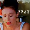 << Lastly I made a new layer and got a round brush and set it to 1px and drew a little squiggle. And wala, icon! I know I suck at explaining things so if you have any questions feel free to ask! Loveeee |
|
|
|
Post by Maryesa on Jun 5, 2008 23:21:18 GMT 10
girls, it seems to easy when you explain that point by point !  I wish I could do the same...but when I see all the photoshop option and so on, it's just too complicated to me !! |
|
|
|
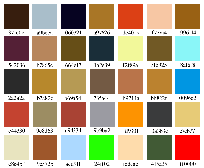
Post by Jana on Jul 30, 2008 4:05:47 GMT 10
|
|
|
|
Post by Rach :) on Aug 2, 2008 22:23:22 GMT 10
Great idea Jana, thanks for that! |
|
|
|
Post by Joosje on Aug 2, 2008 22:49:04 GMT 10
*steals colours for future use*  Thank you |
|
|
|
Post by Jana on Aug 3, 2008 0:35:18 GMT 10
|
|
|
|
Post by manduu ♥ on Aug 10, 2008 6:32:13 GMT 10
I WANNA KNOW HOW THIS GIRL MAKES HER STUFF: www.twobeats.com/photos/click on portraits& people she is amaziiiiiiiiiiiiiiiiing |
|
|
|
Post by María on Aug 10, 2008 7:04:34 GMT 10
^^ it's probably alot more than what photoshop can do..
it's in the photos.. and better programs than photoshop..
|
|
|
|
Post by manduu ♥ on Aug 11, 2008 6:22:41 GMT 10
It's Paintshop Pro |
|
|
|
Post by suzanne on Aug 9, 2009 5:37:21 GMT 10
I'm really new to making art of any kind and was wondering if anyone could help me by telling me if there's any good easy to follow tutorials to make something like these   Any help at all would be very much appriciated!! Thanks, Suz!! |
|
|
|
Post by Martine on Jan 27, 2010 4:48:56 GMT 10
Can anyone tell me where I can find a good free photo-editing program.
I got GIMP now but it's really complicated to use.
I used to have 'Microsoft Picture It', which was so easy to use and had so many possibilities.
What I mainly want to be able to do is add text to a picture (it's for my son's communion pics which I need to make in April ;D)
Thanks a lot!
|
|
|
|
Post by manduu ♥ on Apr 26, 2011 4:18:55 GMT 10
My first tutorial ever heheee.. I'm going from this: 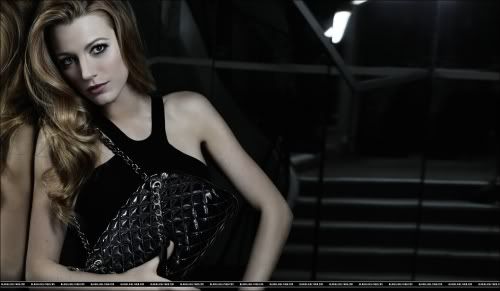 to this:  I cropped it to 100x100 and then i duplicated the base layer and set it to Screen 30% Create a new layer and fill it with #6c90da and set it to Exclusion 20% Create a Curve layer and it should look like this:  Then create a gradient map and put it on black and white, Soft Light 50-70% (what makes your picture better) Create a hue/saturation layer and put saturation on -52 Create a Gradient fill layer, now I'm using the swedish version so I don't really know how to explain this well but make it black and white, and then put it on radial (?) and 90 degrees and invert it. Put it on Screen 20% Create a Selective Colour layer and change: Red:Magenta: -33 Yellow: Cyan: +6 Yellow: -35 Neutrals (?)Yellow: -10 Merge it all down, duplicate and use Unsharp Mask and play with it till you get the result you like. Then I used the Gossip Girl font called Walkway I hope it wasn't wayyyy too bad hehe  |
|