|
|
Post by sissa on Aug 11, 2009 4:17:49 GMT 10
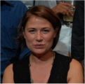
Hey folks, which one do you think would be better for my wall? #1 - oil4 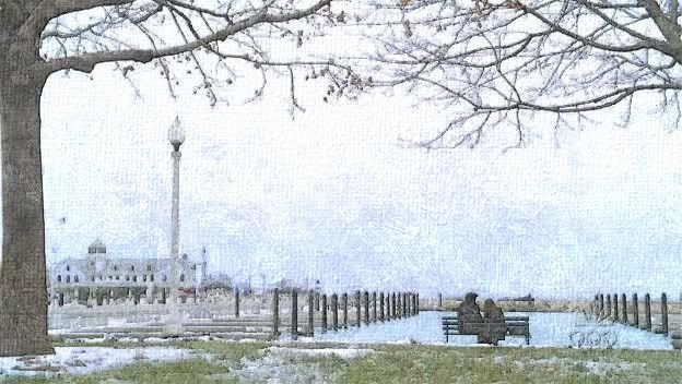 or a darker version? #2 - oil1 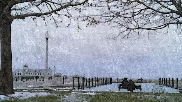 |
|
|
|
Post by Tara on Aug 11, 2009 4:43:52 GMT 10
That looks so cool, Sissa! I vote for #2!
|
|
Taylor
Countess of Luby

Posts: 150
|
Post by Taylor on Aug 11, 2009 4:48:46 GMT 10
I vote for #2 as well!!!
|
|
|
|
Post by thaischrist on Aug 18, 2009 1:57:52 GMT 10
Nice ones' sissa! I vote for 2#!
|
|
|
|
Post by Izzy on Aug 18, 2009 3:58:22 GMT 10
#2! I have the screen cap without the logo at the bottum...
|
|
|
|
Post by sissa on Aug 18, 2009 5:51:24 GMT 10
Thanks for the replies.
Wow, it´s # 2 the winner.
Hi Izzy, thanks for the offer.
I made another version (with the same collor/contrast...) without the logo. The hardest to me was deleting Luka walking to put the part of him with her sitting, because I liked the trees and I wanted the light lamp and building in the left side, but wanted they together...
Or your screencap is just like that? Because I didn´t find a pic like this one - I had to take parts from here/parts from there....
|
|
|
|
Post by sissa on Sept 11, 2009 1:47:38 GMT 10
Thanks to Abby_road for giving me the original pic in bigger size. Well, I could not get over the fact the photo was cut leaving the poor guy (whoever he is) without head. So, I made some big changes now there´s a face ...... 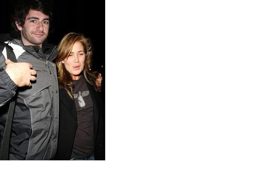 |
|
|
|
Post by Dianne on Sept 18, 2010 11:07:16 GMT 10
Wooooow Sissa, i was looking through the fanart-section and I found your fanart.
That last pic is sooo nice!! Finally a *good* picture, *with* a head!!!
Thanks for making it, you made it fit so good!!!
He's such a cutie!
|
|